
21 Organic
Brand Strategy &
Identity
A sustainability-driven start-up, focussed on the well-being of customers, the upliftment of farmers and the restoration of the environment.

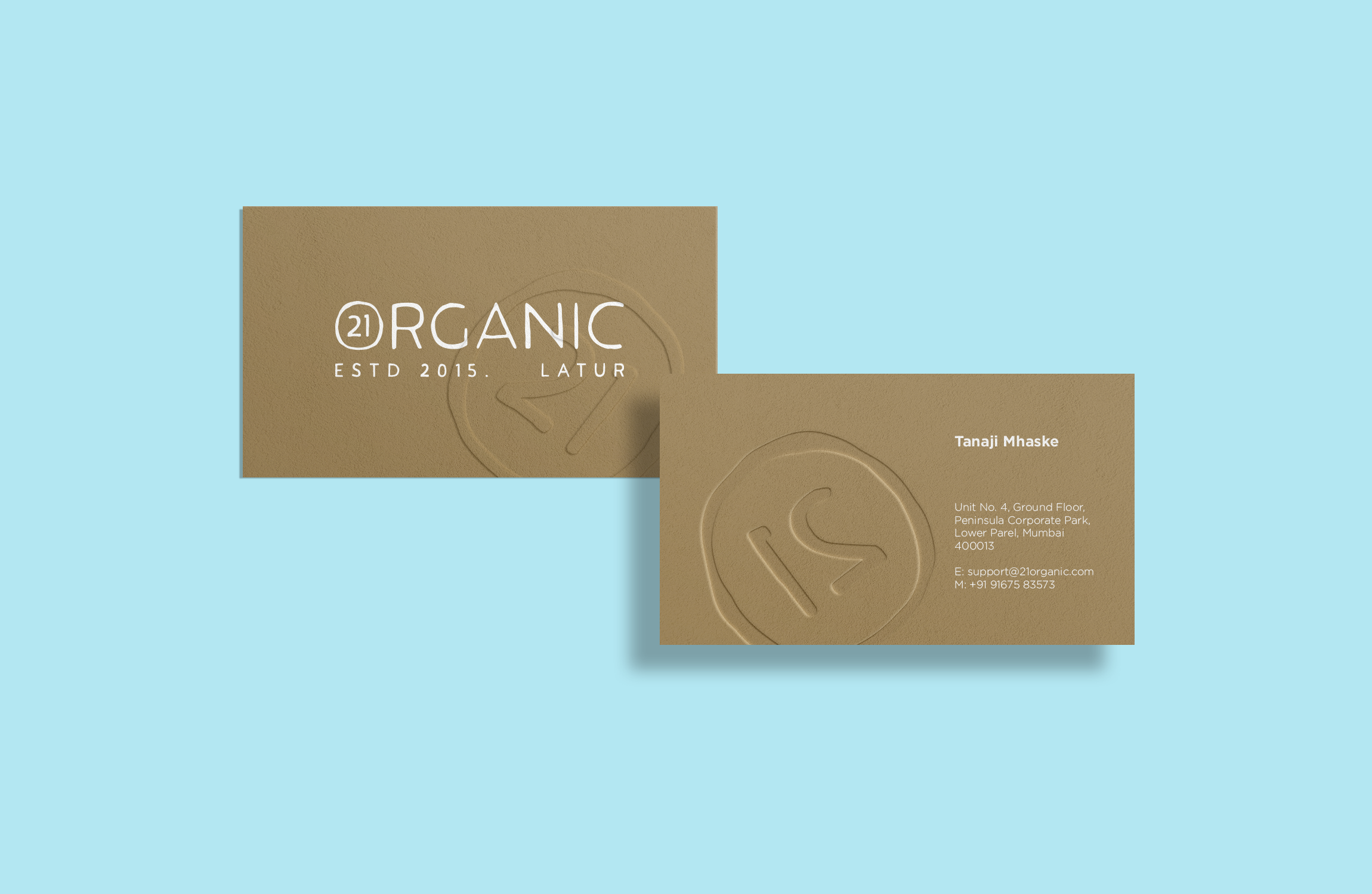
The logo combines Jimmy Sans and Serif fonts for a natural, handcrafted feel that embodies "organic." And the brand mark, its not just part of the logo, it can stand alone on packaging and ads, making the brand super consistent and building loyalty.


Unbleached eco-friendly industrial writing printing papers.

Eco-Friendly
Packaging
From the seeds sown to the harvest reaped to its arrival at your door. Each step is carefully considered. Healing you and healing our environment. We used heat-treated wooden chests as a part of our pilot cycle to onboard our first 100 customers.

Packaging design
The wooden chests were picked for their good looks, strength, and ability to break down naturally over time becoming a part of farm compost. Their heat-treated wood means they can be used again and again for deliveries. With their multi-level layout and wooden dividers, these chests offer customizable compartments to protect produce from damage, all without resorting to single-use plastics.


The sides have handles for ergonomic lifting. The walls have small circular vents for air circulation. The wooden separators can also be turned clockwise to be locked into place and vice-versa. The cotton cord can be pulled to pick up the level separator with ease and the lid is branded using heat irons.


Iconography
We designed custom icons to emphasize the essential features and services.


Direction: Aniket Ghorpade & Vivek Martin
Brand Identity: Aniket Ghorpade
UI/UX: Vivek Martin
Illustration & Photography: Aniket Ghorpade
Creative Copywriting: Aman Singh, Vivek Martin & Yasmin Chinoy
Development: Achieveee Design & Development